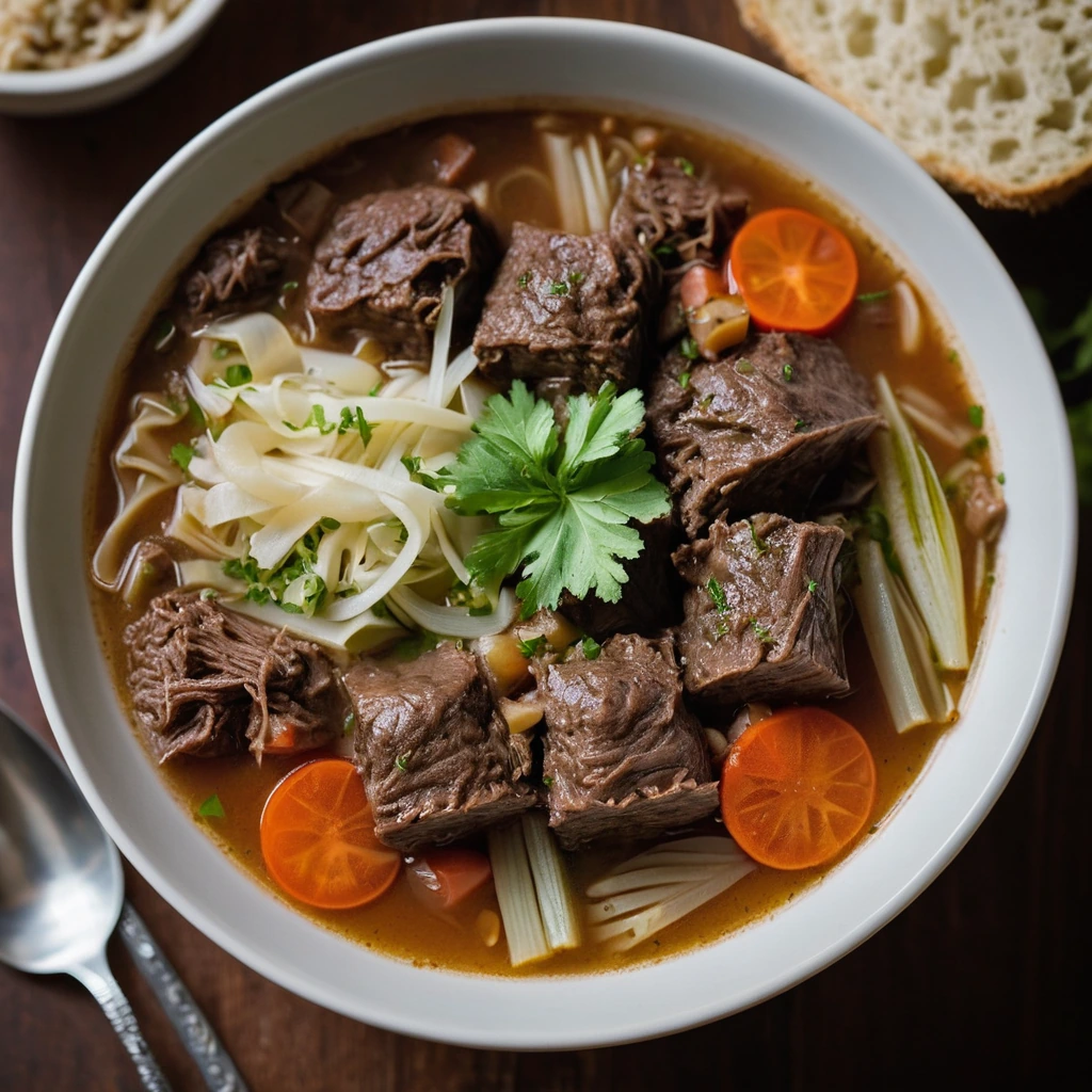
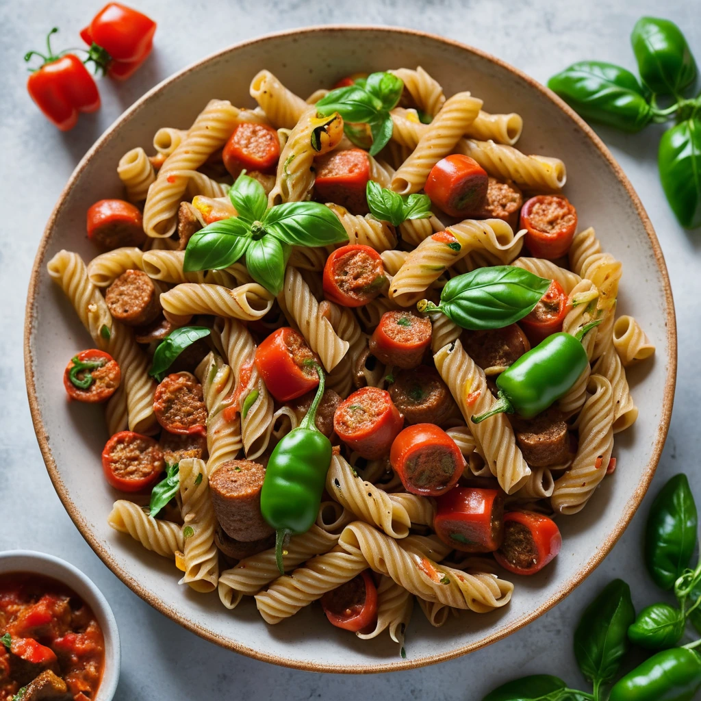
Plating: Balancing Color on the Plate
Plating is an art form that transforms a meal into a visual feast. Balancing color on the plate is crucial for creating dishes that are not only delicious but also Instagram-worthy. The human eye is naturally drawn to vibrant hues and contrasts, making color a powerful tool in culinary presentation. A well-balanced plate should offer a harmonious blend of colors that complement each other, enhancing the overall appeal of the dish. Start by considering the natural colors of your ingredients – think about how greens, reds, yellows, and browns can work together. Remember, it’s not just about making the plate look pretty; it’s about enhancing the dining experience. Color can hint at flavor, texture, and even temperature. For instance, a bright green garnish can suggest freshness, while a deep red might evoke richness. The goal is to create visual interest without overwhelming the senses. Use color theory to guide your choices, but don’t be afraid to experiment. A splash of color here, a subtle gradient there – these are the details that elevate a meal from ordinary to extraordinary. Keep in mind that plating is also about balance. Too many colors can be chaotic, while too few can appear monotonous. Finally, consider how the plate itself interacts with the colors of the food. A white plate provides a clean canvas, while a colored plate can add an extra layer of visual intrigue. Mastering color balance in plating is about practice, creativity, and a keen eye for detail.
Notes
The science behind balancing color on the plate is rooted in visual psychology. Our brains respond to visual stimuli, and color plays a significant role in how we perceive food. When troubleshooting, ask yourself if any color is overpowering the others or if the composition feels harmonious. A common mistake is overcrowding the plate, which can make colors blend and lose their impact. Safety is generally not a concern with plating, but always ensure that any decorative elements are edible and safe for consumption. For make-ahead and storage, consider how colors might bleed or change over time, especially with ingredients like beets or turmeric that can stain.
Steps
- 1 Start with a clean, neutral-colored plate.
- 2 Choose a base color for your dish, usually provided by the main protein or starch.
- 3 Add a contrasting color with a side or garnish, like steamed green beans with roasted salmon.
- 4 Incorporate a third color for complexity, such as a drizzle of orange sauce.
- 5 Use herbs or edible flowers for pops of color and texture.
- 6 Consider the color of your sauces and dressings; they should complement, not clash.
- 7 Arrange components thoughtfully to create a natural gradient or pattern.
- 8 Ensure each color is represented in balanced proportions.
- 9 Experiment with different plate shapes to see how they affect color perception.
- 10 Take a step back to evaluate the overall color balance before serving.
Ingredients to explore
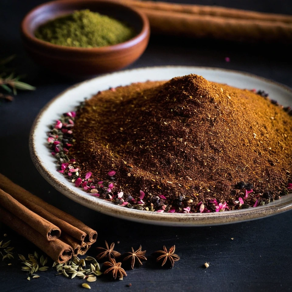
Advieh (Persian Spice Blend)
Advieh is a fragrant Persian spice blend that boasts a complex aroma of warm cinnamon, earthy cumin, and floral hints of rose and saffron. Its texture is finely ground, making it easy to incorporate into dishes. Originating from the rich culinary traditions of Iran, advieh adds depth and sophistication to both savory and sweet recipes. Its unique combination of spices reflects the historical spice trade routes that influenced Persian cuisine.
Almond Extract
A fragrant, golden elixir that captures the essence of freshly ground almonds, almond extract is a pantry staple that brings a rich, nutty aroma to your culinary creations.